- Regular Price
- £19.99
- Sale Price
- £19.99
- Regular Price
- £19.99
- Unit Price
- per

At The Wool Company, today I’m excited to share some subtle updates to our brand, hopefully reflecting our commitment to both our heritage and a fresh, contemporary vision.
First, let's have a little reminder of our old logo.
Since 2006, our 'fleecy horns' logo, designed by the excellent Paul Colledge of Revival Design in Lostwithiel, has proudly represented The Wool Company. The longevity of the logo has been a testament to the quality of Paul's work.


It's been a while, but we feel it's time for a revision... We've gently refreshed our logo, keeping the principle of our 'fleecy horns' motif that has long represented our focus on quality and a modern take on tradition. The updated font selections bring a more modern touch, enhancing clarity and elegance.

We brought ‘Marshall’, our first male goat, back to the farm in the boot of our ancient Mercedes estate in 2005 when he was small enough to stand up in it. Marshall was a buck of the British Boer Goat breed and was a huge character. Our young business grew around him and his Angora goat does. He taught us and our own kids a lot of love and respect for goats.
For a while, we were stewards of the official English national flock of the Manx Loaghtan rare sheep breed, for the Rare Breeds Survival Trust. I remember a lovely pair of Manx Loaghtan rams, whom we named after the Hollywood shepherds Ennis and Jack – not exactly good value for money, but they were clearly happy together. And one of them eventually got the job done–after we separated the loving couple and left them with only ewes.
Our next ram was 'Les', a fine old Bluefaced Leicester sheep whom we crossed with some Swaledale ewes to create mules. We are also surrounded by Herdwicks on Bodmin Moor.
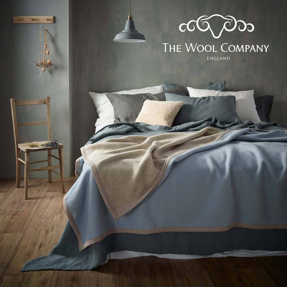
The updated logo is inspired by a blend of all these breeds. The intent is that our new logo reflects our own history while being a little more refined and modern than the original.
Our brand refresh isn't really about a new look—it's more a signal of continuity of our values. The refined design quietly underscores our commitment to sustainability, supporting female workers, small-scale producers, designers and makers, and celebrating traditional crafts.
For the project, we collaborated with the talented young designer Gracie Ashton, who brought a fresh perspective while staying true to our roots. Her interpretation of our brief led to the evolution of our fleecy horns logo and its components.


Our updated font selections bring a modern touch, enhancing both clarity and elegance. This design evolution balances the timeless nature of our products with a contemporary aesthetic.
As we move forward, we're excited to continue sharing the beauty and versatility of wool and other noble fibres with our community. Our updated website now offers a more streamlined shopping experience, making it easier to explore and appreciate the unique qualities of our products.
Thank you for being part of our journey. We look forward to continuing to provide you with products that are a modern take on traditional quality.
0 comments